Interview with Jason Edmiston
/
Jason Edmiston is a commercial illustrator since 1996, he has created work for advertising, editorial, packaging and book publishing clients internationally. He is a traditional artist, painting in acrylic on watercolour paper or wood panel. His style ranges from realism to exaggeration, usually emphasizing the figure, and a certain degree of humour or caricature. Jason is often asked to emulate a specific genre of illustration, such as movie posters, pulp covers or retro style advertising. His fondness for pop culture, especially movies and toys often creep into his work.
Hi Jason, today MoW selected 7 of your artworks inspired by music. Can you tell MoW why you chose those music artists ?
These are some of my favorite musicians. I grew up in the eighties, and these guys were always in my tape deck. I also thought they had great personality, and iconic ways of dressing.
What was the music behind the artworks ? What inspired you to create them ?
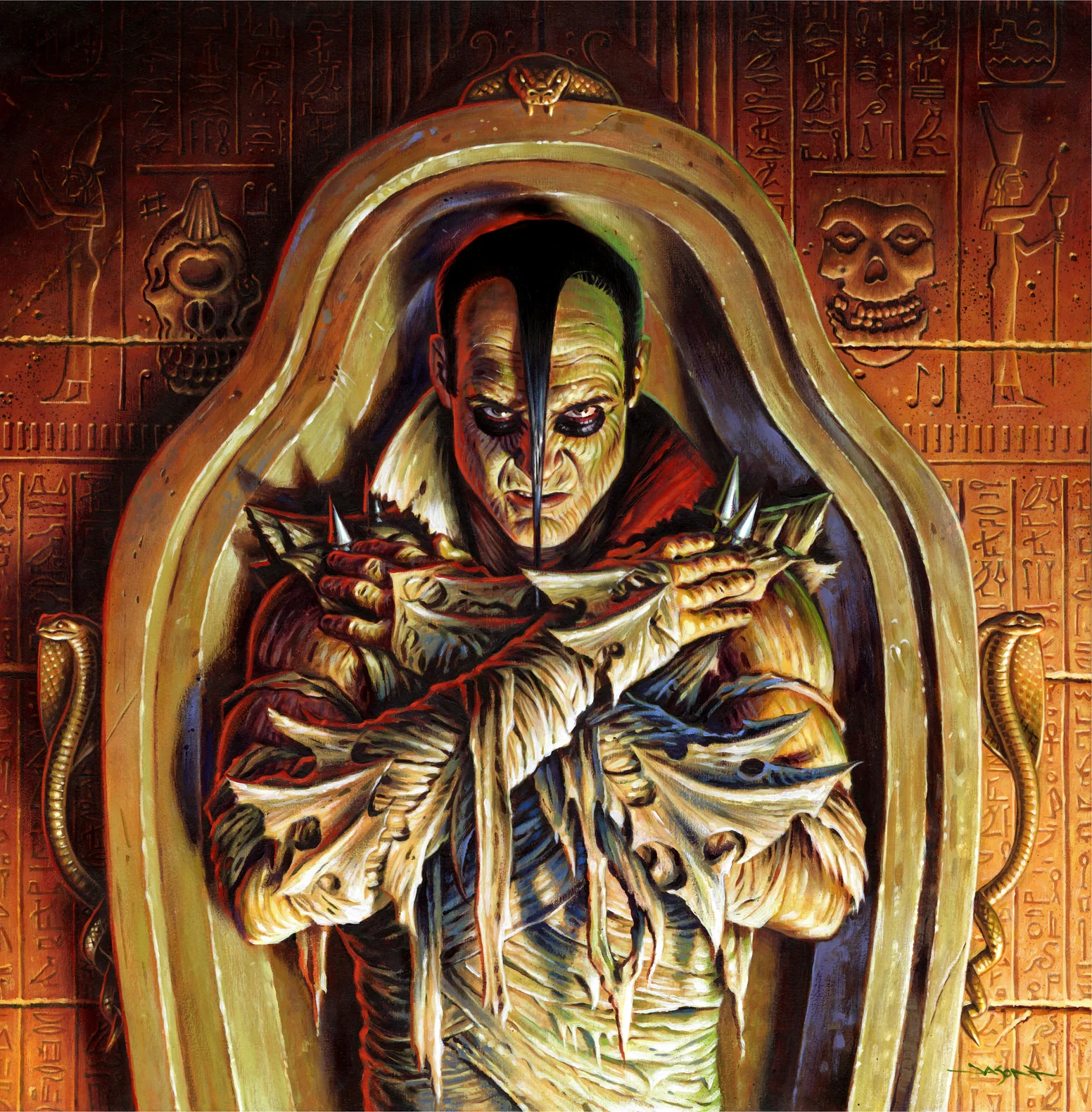
Not sure what you mean, but the inspiration was the music itself. A lot of the punk and Heavy Metal music of the time was larger than life, and often talked about battling the devil, or monsters, or crazy drug trips. I thought it fit to turn the artists into creatures, themselves.
Why is music important to you and your art?
I'm more driven by the melody than the lyrics actually, so I respond to the driving beats, and wailing guitars. These inspire me to get excited about my work, and puts energy into each brushstroke.
If you had to choose between the artworks presented today, which of your artwork would be your favorite ? And why ?
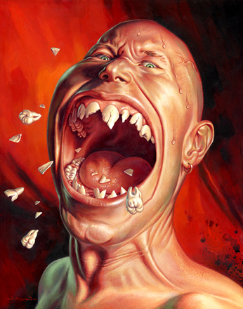
My favorite is probably the Tommy Lee portrait (see on the left). I had a photo of Tommy floating around my office for years. It was a press photo from the early years of Motley Crue, and it was utterly 80's. The hair, the makeup, the outfits. Ridiculous, but cool at the same time. Locked in an era. I decided that I wanted to turn this picture into something else, and the Monsters of Rock were born. It even won a spot in the American Illustration awards annual that year.
Can you tell MoW more about the techniques you used. How old is your technique? How did it start? How long does it take you to make an artwork ?
My technique is an old masters way of working, with underpainting, and building up thin transparent layers of paint. Here is a breakdown: After thinking up a concept, I start with a rough pencil drawing to work out the composition. This is usually the part that I struggle over the most. If it works at this stage, the rest I find, is just polishing. After a rough comp is approved by me or the client, I compile photo reference (from the internet or my picture file), or shoot my own models.
Next I tighten the drawing up with an indication of light and shadow at full size. This is the size I will be painting at, which is usually 50% bigger than it will be reproduced (this is unless it is a large painting, and then I just work at a comfortable size for the amount of detail in a piece, then blow up the pencils later to paint it). This drawing is scanned and sent to the art director for approval. Unless changes are required, I move on to paint.
The drawing is printed out on bond paper, and if large, it is printed on multiple pieces of paper and tiled together. I then trace the main outlines of the drawing by using a piece of graphite paper in between the line art and my painting surface (sometimes a gessoed wood panel if I’m painting a hanging piece, and sometimes gessoed watercolor paper if it’s for print).
The first step in adding paint is to work up a full value painting in raw umber, to get a medium tone on the board so it’s easier to balance contrast and pull the colors together. From here on I start from the background and move forward, usually painting each area to about 90% of full values (not the brightest or darkest values until the end). Then I move on to the next section of the piece that is “closer” to the viewer. As a rule, the first values that I paint in an area, be it background, midground, foreground..are the mid-dark values which imply shadows. Then I add mid-light values, then move darker, then go lighter, back and forth until i’ve pushed the range from very dark in some shadow areas to very light on the highlights. This way you can control the piece and always take it a little more in either direction if it’s desired. I tend to gravitate towards art that is color saturated and has lots of value range.
As a final adjustment, I might take a painting into Photoshop and tweak the color balance or levels a little to make it pop a little more or tone it down a little if I’ve gone a little astray.
Do you have plans on creating new artworks insipired by music ?
No plans, but I'm sure I will. I'm hoping I'll get to do some more album cover art jobs soon.
Do you listen to music when you’re working ? If so, what kind of music ?
All the time. Usually fast, loud music, but all styles.
What is the song you liked the most lately? The album ? What was the last gig you went to ?
I love the new Body Count single "Talk Shit, Get Shot". Fun, stupid, angry.
The last gig was Killswitch Engage in Manhattan. Crazy mosh pit that night.
Are you a musician yourself?
I used to play brass instruments in high school, and was pretty good at it, but left it a long time ago.
Find out more about Jason Edmiston here :
www.facebook.com/Jason.Edmistons.Artbook
instagram.com/jasonedmistonart/


